How to Customise Your Zenler Blog
 David Zenler
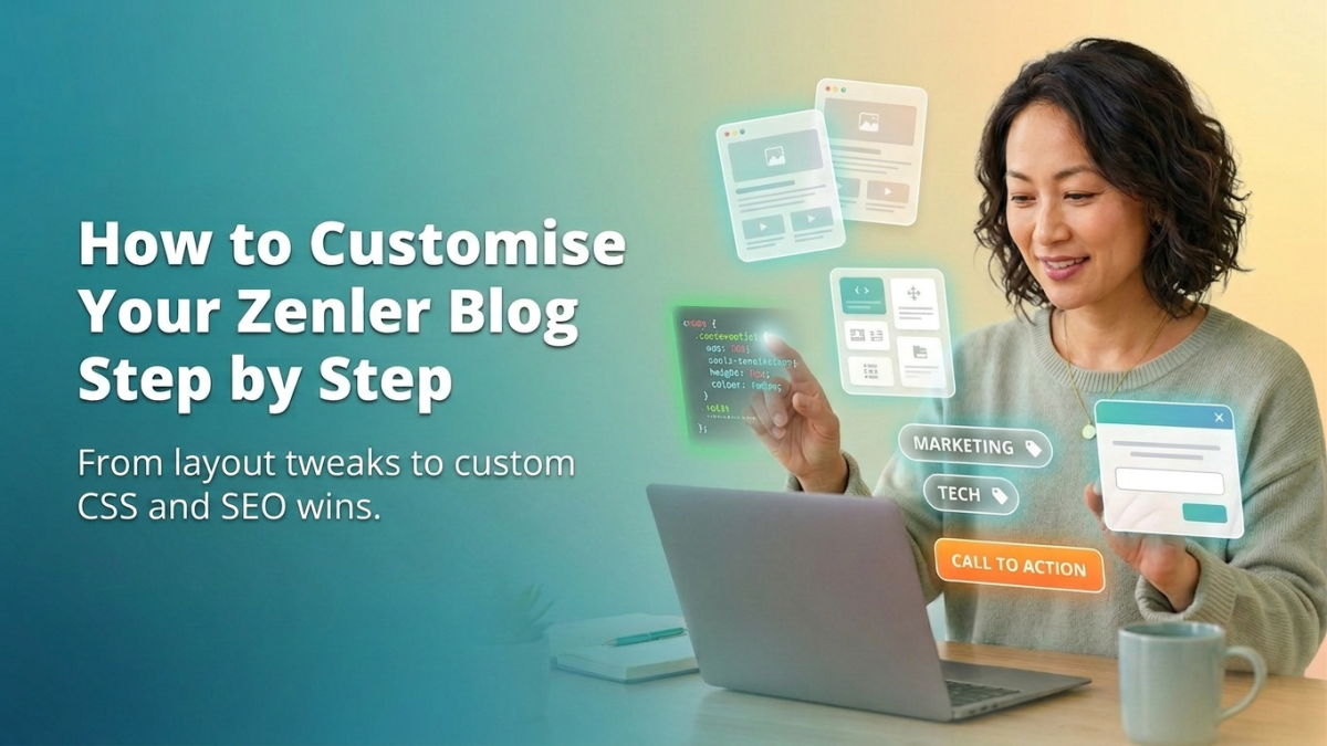
Learn how to customise your Zenler blog using templates, page blocks, CSS, categories, calls to action, pop-ups and practical SEO improvements.
A blog is not just somewhere to publish articles. It can help people discover your work, learn from you, trust you and eventually take the next step with your business.
But there is a problem. Many people create a blog inside Zenler, publish a few posts and assume the layout they see is the layout they have to keep.
Think again.
Zenler gives you more control than you may realise. You can change the layout around your posts, add new page sections, improve your typography, create calls to action, organise articles into categories and even use custom CSS to change elements that are not available inside the standard editor.
During my mini-workshop on 31 July 2026, I demonstrated how to format and customise a blog inside Zenler. This guide takes you through the main points from that session and shows you how to apply them to your own site.
Can You Customise a Blog in Zenler?
Yes, you can customise a Zenler blog.
Zenler provides separate templates for the main blog page and individual blog posts. You can use the page builder to add sections around the dynamic blog content, adjust default elements, organise posts into categories and apply custom CSS for more detailed styling.
You can also add:
- Hero sections
- Lead magnets
- Email sign-up forms
- Course promotions
- Buttons
- Pop-ups
- Custom headers
- Custom footers
- Category navigation
- Calls to action
The important thing is knowing which blog template you are editing. This is where many people get stuck.
Understanding the Two Zenler Blog Templates
Zenler has two main blog templates:
- The main blog page
- The individual blog post page
They are connected, but they do different jobs. When you understand the difference, customising your blog becomes much easier.
What Is the Zenler Blog Page?
The main blog page acts as the entrance to your blog. It normally displays a collection of your published posts and allows visitors to browse your content.
Depending on your design, it may contain:
- Your blog name
- An introductory heading
- Featured posts
- Blog categories
- Post images
- Article excerpts
- Author information
- Publication dates
- Buttons or calls to action
Think of this page as your content library. Someone landing on it should quickly understand what you write about, who the content is for and where they should begin.
For example, if your blog helps course creators build and sell online programmes, make that clear at the top of the page. You could use a heading such as:
Practical advice for creating, launching and growing your online course business.
That one sentence gives the visitor context. It also gives search engines and AI Search tools a clearer understanding of the blog's main subject.
What Is the Zenler Blog Post Page?
The blog post page is the template used to display each individual article. The article title, image and main content change from post to post, but the surrounding layout remains consistent.
This means you can customise the template once and have those changes appear across all your blog posts. You might add:
- A branded header
- A newsletter sign-up form
- A promotional banner
- An author section
- A link to a free resource
- A course invitation
- Related categories
- A call to action below the article
- A consistent footer
This is worth understanding before you start editing. Changing the main blog page will not necessarily change the design of your individual articles. In the same way, changing the blog post template could affect every article on your site.
Before making a change, pause and check which template you are working on. It sounds obvious, but it can save you a lot of confusion.
How to Use the Zenler Page Builder on Your Blog
Zenler automatically places your blog posts or article content inside a dynamic section. You do not normally edit the individual post cards or article content directly from the template. Instead, you customise the areas around that dynamic section.
This gives you space to create a more useful and branded experience. You can add blocks above the blog feed, below the blog feed or around the content on an individual blog post template. This is simple to do once you know where the dynamic content begins and ends.
What to Add Above Your Blog Posts
The space above your blog feed is useful because it is normally the first thing a visitor sees. Do not waste it with a generic heading such as "Our Blog" unless that really is all you need.
Use this area to explain what the visitor will find. You could add:
- A hero banner
- A short welcome message
- A description of your main topics
- Links to important categories
- A featured article
- A free guide
- An email sign-up form
- A current announcement
Imagine you are a business coach helping people start an online business. Instead of simply displaying your latest posts, you might open with:
Straightforward advice to help you build, market and grow an online business without getting lost in unnecessary technology.
That immediately tells the reader whether they are in the right place. You could then include links to categories such as:
- Starting an Online Business
- Course Creation
- Email Marketing
- Content Creation
- Business Growth
This makes the page easier to use and gives visitors a clear route into your content.
What to Add Below Your Blog Feed
The area below your posts is where you can guide the visitor towards a sensible next step. Someone who reaches the bottom of your blog page has already shown interest. They have looked through your content and may be ready to do something more.
You might invite them to:
- Download a free guide
- Join your email list
- Register for a workshop
- Explore one of your courses
- Book a call
- Join a membership
- Watch a related video
The important word here is relevant. Do not add a random offer simply because you have space available. If your articles are about creating online courses, a course planning checklist makes sense. An unrelated promotion does not. The customer journey should feel natural.
How to Create a Better Blog Call to Action
A call to action tells the reader what to do next. A useful CTA should make three things clear:
- What the reader should do
- What they will receive
- Why it is worth doing
For example:
Ready to plan your first online course? Join our free training and learn how to turn your knowledge into a structured programme your students can follow.
Your button could say: Start the Free Training
That is much clearer than "Click Here." "Click Here" tells the reader nothing about where they are going or what they will receive.
Your CTA should also connect directly with the content around it:
- An article about course pricing could lead to a pricing workshop
- A guide about building a membership could lead to a membership planning template
- A post about recording videos could lead to an OBS workshop or video production guide
The closer the offer is to the subject of the article, the more natural it feels.
Avoid Adding Too Many Calls to Action
More buttons do not automatically mean more conversions. In fact, too many competing choices can make people do nothing.
You might ask someone to join your newsletter, book a call, download a guide, follow you on social media and buy a course — all on the same screen. That is a lot to process.
Choose one main action for each important section. You can still include secondary links, but the primary next step should be easy to spot.
Ask yourself: What is the most useful thing this reader could do next? Build your main CTA around that answer.
Replacing the Default Zenler Blog Header
Zenler's default blog elements help you get started quickly, but they may not match the rest of your website. You may decide to remove or replace the standard header on your blog page or blog post template.
This can help you create a more consistent experience across:
- Your main website
- Your course pages
- Your checkout pages
- Your blog
- Your membership area
However, do not remove important navigation simply to make the page look cleaner. Your replacement header may still need:
- Your logo
- A link to your homepage
- Course or product links
- A blog link
- A contact option
- A login button
The same applies to your footer. Legal pages, privacy information, terms and contact details should remain easy to find.
A clean design is good. A clean design that leaves the visitor lost is not.
How to Use Custom CSS in Zenler
CSS stands for Cascading Style Sheets. It controls how elements appear on a webpage. You can use CSS to adjust:
- Font sizes
- Text colours
- Heading styles
- Line spacing
- Paragraph spacing
- Background colours
- Button designs
- Borders
- Margins
- Padding
- Alignment
Zenler's page builder already gives you control over many design settings. Custom CSS becomes useful when the editor does not include the exact option you need.
For example, you might want to change the blog post title size across all your articles. A simple CSS rule might look like this:
css
.blog-post-title {
  color: #222222;
  font-size: 42px;
  line-height: 1.2;
}
The important point is that the class name must match the element on your Zenler page. Do not assume that every example you find online will work immediately — the selector used in the example may not match the structure of your own page.
What Is a CSS Selector?
A CSS selector tells the browser which element you want to change. In this example:
css
.blog-post-title {
  color: #222222;
}
.blog-post-title is the selector. The styling inside the brackets is applied to the element using that class.
The more specific the selector, the easier it is to control where the design change appears. A very broad rule could change headings across your entire site when you only wanted to change headings inside your blog. This is why it is better to work carefully and add one change at a time.
When to Use !important in Zenler CSS
Zenler may already have a style applied to the element you want to change. Sometimes you add your own CSS, refresh the page and nothing appears to happen. This usually means the existing rule is taking priority.
The !important declaration can force the browser to prioritise your custom value. For example:
css
.blog-post-title {
  color: #222222 <b>!important</b>;
  font-size: 42px <b>!important</b>;
  line-height: 1.2 <b>!important</b>;
}
This can solve the problem, but do not add !important to everything automatically. Too many forced rules can make your CSS harder to manage later.
Use this process:
- Add your CSS without
!important - Save and preview the page
- Check whether the style has changed
- Add
!importantonly where it is needed - Test the page again
- Check both desktop and mobile
- Keep a copy of any CSS that is working correctly
You will be glad you did if a later change affects something unexpectedly.
How to Improve Your Blog Typography
Typography is not just about choosing a nice font. It affects whether someone can comfortably read your article.
You could publish the most useful guide in your industry, but if the font is tiny, the paragraphs are cramped and the content stretches across the full width of a large monitor, people will struggle. They may leave before they reach the useful part.
Review the following areas on your Zenler blog.
Body Font Size Your article text should be large enough to read comfortably. Do not judge this only from the page builder preview. Open the live page on a laptop, phone and tablet. What looks neat inside the editor may feel much smaller on an actual device.
Heading Sizes Your headings should create a clear structure. A visitor should be able to scan the article and understand the main points without reading every paragraph. Your main article title should be the strongest heading. Your H2 headings should divide the main sections, and H3 headings should only be used when they genuinely help organise the content.
Line Height Line height controls the space between lines of text. A little extra space can make long articles much easier to read. For example:
css
.blog-post-content p {
  line-height: 1.7 <b>!important</b>;
}
Do not increase it so much that each line appears disconnected from the next. The aim is comfortable reading, not empty space.
Paragraph Spacing Large blocks of text feel like work. Use clear spacing between paragraphs and vary their length naturally. Some ideas need a few sentences. Others only need one. Like this. That change of rhythm makes an article feel easier and more human to read.
Content Width Very long lines are tiring. On a large desktop screen, consider limiting the width of the main article content. This stops the reader's eyes travelling too far across the page. You do not need to make the article extremely narrow — just avoid stretching each paragraph across the full browser width.
Colour Contrast Make sure the text is easy to see against the background. Light grey text on white may look stylish in a design preview, but it can be difficult to read. Clear contrast is particularly important for:
- Body text
- Buttons
- Links
- Form labels
- Small captions
- Mobile navigation
Readability comes first.
Can AI Write CSS for Your Zenler Blog?
Yes, AI can help you write CSS for your Zenler blog. This is useful when you know what you want to change but do not know how to write the code.
You could ask an AI assistant:
Write CSS that changes the H2 headings inside my blog posts to 38 pixels, makes them dark blue, gives them a line height of 1.3 and overrides the platform's default styles.
It may return something like:
css
.blog-post-content h2 {
  color: #17365d <b>!important</b>;
  font-size: 38px <b>!important</b>;
  line-height: 1.3 <b>!important</b>;
}
That gives you a starting point. The key phrase is starting point. AI may know how to write the style, but it may not know the exact class names used on your Zenler page. You will often need to provide more information.
For better results, give the AI:
- Your existing CSS
- The class name of the element
- A screenshot
- The current style
- The result you want
- Details of how it should appear on mobile
Be specific. "Make my blog look better" is not a useful instruction. "Make the H2 headings 34 pixels on desktop, 28 pixels on mobile and add 24 pixels of space above them" gives the AI something it can work with.
Add One CSS Change at a Time
This is a simple habit, but it can save you a lot of time. Do not paste 20 new CSS rules into your site and then try to work out which one broke the layout.
Add one change. Save it. Preview the page. Check desktop and mobile. Then move to the next change. When something goes wrong, you will know which rule caused it.
Remember, customisation does not need to happen in one afternoon. Build it gradually.
How to Organise Zenler Blog Posts With Categories
Categories help visitors find articles on related subjects. They also make a growing blog easier to manage.
For example, a course creation business might use:
- Course Creation
- Marketing
- Student Engagement
- Video Production
- Business Growth
A health or fitness business might use:
- Strength Training
- Nutrition
- Mobility
- Recovery
- Beginner Guides
Try to keep categories broad enough to contain several useful articles. Creating a separate category for every post does not improve organisation — it simply creates a long list of sections with very little inside them.
Start by identifying the main subjects you regularly write about. For most blogs, a small number of clear categories will work better than dozens of overlapping ones.
Categories can also help with internal linking. For example, an article about increasing course completion could naturally link to another post in your Student Engagement category. This gives the reader more useful information and helps search engines understand how your content connects.
How to Reorder Blog Posts in Zenler
The order of your blog posts affects which articles receive the most attention. New posts will often appear first, but the newest article is not always the most useful article to feature.
You may want to give more visibility to:
- A cornerstone guide
- A high-converting tutorial
- A product announcement
- An important update
- A seasonal article
- A workshop registration post
- A popular beginner guide
Think about what the visitor needs to see first. Your opening selection of posts should represent the strongest and most relevant content on the site.
Look at the complete presentation:
- Is the title clear?
- Does the image make sense?
- Is the excerpt useful?
- Does the article match the needs of your audience?
- Is the information still current?
You can also change the order during a launch or campaign. For example, if you are running a workshop about OBS and content repurposing, you might temporarily feature your most relevant recording and video production articles. Once the campaign ends, you can review the order again.
How to Improve SEO on a Zenler Blog Post
Blog design can improve the reader experience, but appearance alone will not make an article rank. The content still needs to answer a genuine question.
Every Zenler blog post should normally include:
- One clear topic
- One H1 title
- A useful introduction
- Search-friendly H2 headings
- Relevant internal links
- Descriptive image alt text
- A clear SEO title
- A useful meta description
- A readable URL
- A natural next step
- An FAQ section where appropriate
Avoid forcing the same keyword into every paragraph. That makes the writing feel unnatural and does not help the reader. Use the main phrase where it belongs, then include related language naturally throughout the article.
For example, a post targeting "how to customise a Zenler blog" may also mention:
- Zenler blog templates
- Blog page design
- Individual post layouts
- Custom CSS
- Blog categories
- Zenler SEO settings
These phrases support the main subject without repeating the exact keyword again and again.
Make the Answer Easy to Find
People often arrive on a blog because they have a specific question. Do not make them read 700 words before giving them the answer.
For example, under the heading "Can You Customise a Blog in Zenler?", give the answer immediately. Then explain the details. This works well for human readers and also makes the content easier for AI Search engines and answer tools to understand.
A clear answer-first structure might look like this:
Yes, you can customise a Zenler blog using separate blog templates, page builder blocks, categories, pop-ups and custom CSS.
The rest of the section can then show the reader how.
Use Internal Links Naturally
Internal links help visitors discover more of your content. They can also show search engines which pages on your site are connected.
Add links where they genuinely help the reader. For example:
Once your blog layout is ready, this guide to creating an online course can help you plan the content your audience may want to learn from next.
That is more useful than adding a random list of links at the bottom of the article. Use anchor text that describes the destination. Avoid vague phrases such as "Click here," "Read more" or "Find out more." Tell the reader what they are opening.
How to Use Pop-Ups on Your Zenler Blog
Zenler pop-ups can be used to display forms, offers, announcements or calls to action. They can appear based on different visitor behaviours, including:
- Time spent on the page
- How far the visitor has scrolled
- A button click
- Exit behaviour
- The page being viewed
A newsletter pop-up might appear after someone has read 60% of an article. At that point, the person has already shown interest in the subject. The invitation feels more relevant than a pop-up that appears as soon as the page loads. For example:
Enjoying this guide? Get practical Zenler tips sent directly to your inbox.
The button could say: Send Me the Tips
The benefit is clear, and the reader knows what will happen next.
Do Not Let Pop-Ups Ruin the Experience
Pop-ups can help you grow an email list or promote an offer. They can also annoy visitors.
A useful pop-up should be:
- Relevant to the page
- Easy to close
- Clear about the benefit
- Mobile-friendly
- Shown at a sensible time
- Limited in frequency
Test the experience on a phone. A pop-up that looks fine on desktop may cover the entire mobile screen, hide the close button or make the page difficult to use. The aim is to help the reader take the next step, not block them from reading.
What to Test Before Publishing Your Blog Changes
Do not assume a page is working simply because it looks correct inside the Zenler editor. Check the live version.
Test it on:
- Desktop
- Tablet
- Mobile
- More than one browser
- Logged-in and logged-out views where relevant
Review the following:
- Headings
- Body text
- Buttons
- Links
- Images
- Menus
- Forms
- Pop-up triggers
- Header navigation
- Footer links
- Mobile spacing
- Custom CSS
Also test the complete visitor journey. Open the blog as though you have never seen it before.
- Can you understand what the blog covers?
- Can you find a useful article?
- Can you move between categories?
- Do the links work?
- Can you complete the form?
- Does the CTA lead to the correct place?
This simple test often reveals problems that are easy to miss while building the page.
Common Zenler Blog Customisation Mistakes
A few mistakes appear regularly when people start changing their blog design.
Editing the Wrong Template You make a change and expect it to appear on an article, but you have edited the main blog page. Always check whether you are editing the blog directory or the individual post template.
Using Too Much Custom CSS Custom CSS is useful, but more code does not automatically mean a better design. Start with the changes that will make the biggest difference.
Forgetting Mobile Visitors A layout can look excellent on a large screen and fall apart on a phone. Test each important change on mobile.
Adding Too Many Offers A blog full of banners, buttons and pop-ups can feel more like a sales page than a useful resource. Help the reader first.
Using Small or Low-Contrast Text Stylish text is not useful if people cannot comfortably read it.
Creating Too Many Categories Keep your category structure simple. Five useful categories are often better than 25 categories containing one post each.
Publishing Without Testing the Links A broken button can undo all the work you put into the page. Click everything before you publish.
A Simple Order for Improving Your Zenler Blog
You do not need to redesign everything at once. Start with the basics.
- Decide what your blog is for
- Check the main blog page template
- Check the individual blog post template
- Add a clear introduction
- Improve the font size and spacing
- Create useful categories
- Add one relevant call to action
- Test the layout on mobile
- Add custom CSS only where it is needed
- Review the visitor journey
This gives you a strong foundation. Once the basics are working, you can experiment with pop-ups, lead magnets, promotional sections and more advanced styling.
This is not an overnight success. Your blog will improve as you publish more content, learn what your readers respond to and refine the layout.
Frequently Asked Questions
Can I customise the main blog page in Zenler? Yes. You can use the Zenler page builder to add custom sections above and below the dynamic blog feed. This allows you to add headings, images, forms, buttons, lead magnets and other content around your list of posts.
Can I change the design of every Zenler blog post? Yes. Zenler uses an individual blog post template for your articles. Changes made to this template can appear across all posts, so test carefully before publishing major layout or CSS changes.
Do I need to know CSS to customise a Zenler blog? No. Many changes can be made with the Zenler page builder. CSS is useful when you want to change an element that does not have a built-in design control.
Can AI help me write CSS for Zenler? Yes. AI can create CSS rules based on your instructions, but you may still need to provide the correct class name or selector. Always test generated code before applying it across your live site.
Why is my Zenler CSS not working?
The existing platform style may be taking priority, the selector may be incorrect or the CSS may be targeting the wrong element. Try a more specific selector and use !important only when it is genuinely needed.
Should I use !important in all my CSS?
No. Use it only when the standard styling cannot be overridden in a cleaner way. Applying it everywhere can make future design changes harder to manage.
How many blog categories should I create? There is no fixed number, but a small group of clear categories usually works best. Each category should be broad enough to contain several relevant posts.
Can I add a sign-up form to a Zenler blog? Yes. You can add a form or lead capture section above or below the blog feed, inside the blog post template or through a relevant pop-up.
Are pop-ups good for blog conversions? They can be effective when they are relevant, easy to close and shown at an appropriate time. Avoid displaying a large pop-up before the visitor has had a chance to read the page.
How does blog formatting help SEO? Clear headings, readable text, mobile-friendly layouts, descriptive links and good navigation make content easier for visitors and search engines to understand. Formatting supports SEO, but the article still needs to answer the reader's question properly.
Ready to Improve Your Zenler Blog?
Start with one page. Open your main Zenler blog template and look at it through the eyes of a new visitor.
- Is it clear what the blog is about?
- Can people find the right content?
- Is the text easy to read?
- Is there a useful next step?
Make one improvement, save it and test it. Then make the next one.
Zenler gives you the tools to turn a standard blog into a useful part of your wider website and business. The aim is not to fill every available space with more design elements — the aim is to help people find useful information, read it comfortably and continue their journey with you.
Are you ready to put it into practice?
Try Zenler risk-free for 30 days and unlock the Accelerator Programme, designed to guide you step by step as you build your online course business.
Categories: : Micro Blog for Creators
Copyright © 2026 Zenler. All rights reserved.
Terms | Privacy Policy | Cookie Policy | Support